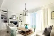
Photo: Steven Dewall
“How do you live?” is a loaded question. The vision in our heads is an idyllic one, and we see it play out on shows like House Hunters all the time. The fantasy version of yourself entertains nearly every weekend, so a large kitchen island with a prep sink is a non-negotiable. In reality, you host game night once every six months and the food delivery app on your phone gets more action than the oven ever does.
“The most important part of the design process is being honest with your designer about the way you live,” says interior designer Sarah Barnard of Sarah Barnard Design. “Don’t pretend you don’t smoke, let me buy you cool ashtrays! Are you more interested in television and cocktails than dinner parties? Let’s make it so.”
Photo: Steven Dewall
When conceptualizing the design for this beachy bachelor pad in Santa Monica, Barnard allowed her client’s lifestyle to inform her decision making. “My client loves the ocean air and spent many an early morning surfing in his youth,” says Barnard. “Because the demands of his career limit his time outdoors, it was important that his home feel connected to the natural world he loves.”
Barnard rejigged the rooms to suit her client’s needs, turning what was formerly an eat-in kitchen into an “intimate space for more formal meals” and repurposing the dining room “to enlarge the living room entertaining area and create a gorgeous marble bar.”
Photo: Steven Dewall, painting by Reid Winfrey
“The new design allows for a prominent display of his liquor collection and an open floor plan where guests can snack and lounge,” says Barnard, adding that her client does, in fact, entertain friends and family regularly. Concealed storage below the bar hides bitters, glassware and the like, and the walnut and leather bar stools were designed by Neri and Hu for De La Espada.
Photo: Steven Dewall, painting by Reid Winfrey
In the living area, American walnut, Calacatta marble and vintage brass combine to create an aesthetic that’s masculine and refined. “The color palette is born from the natural tones of the local landscape,” explains Barnard. The fireplace, which the home’s previous owner had outfitted with an “ill-fitting stone slip,” was plastered over and accented with marble.
Photo: Steven Dewall
The dining nook opens onto the outdoor patio, which makes it susceptible to shuffling feet and bright sunlight. “The rug is specially made to survive exposure to outdoor elements. It can endure years of heavy traffic, withstand spot cleanings, professional cleanings and even the occasional rinse with a garden hose,” says Barnard. The dining table was one of the client’s only existing pieces, and Barnard freshened it up with new chairs, lighting and art.
Photo: Steven Dewall
“The outdoor patios and roof deck were formerly underused,” says Barnard. “One of our priorities was to create regularly enjoyed outdoor spaces with all the comforts of indoor rooms. Plush, comfortable chairs and lush potted plants were paired with custom overhead shades to create serene, restorative outdoor spaces.”
Photo: Steven Dewall
Vintage treasures are sprinkled throughout the home — intentionally layered and grouped together to “create [an] experience that is both comforting and inspiring.” Barnard’s client enjoys smoking (this is California, after all), so she sourced “vintage brass oceanic themed ashtrays” from dealers across the United States. One of her favorites is the grinning whale that rests on a natural teak root ball that functions as a side table on the patio.
Photo: Steven Dewall
The architectural staircase, which Barnard painted a bright white, leads to a second floor landing area with a laundry closet and storage cabinet. “My client liked the current location of the laundry room but not the burden of viewing the utilitarian space several times a day,” explains Barnard. “The interior of the laundry closet was reworked to provide concealed storage for detergent and supplies. A custom stone countertop was built over the existing machines to create a convenient folding surface.”
Photo: Steven Dewall
The adjacent hall cabinet was in need of some TLC. “The wood doors were sanded and painted, the countertop upgraded with a remnant of marble from the first-floor bar and the backsplash tiles selected to add three-dimensional interest.” Barnard meticulously laid out the artisan-made tiles by hand, ensuring the different tones blended seamlessly with one another.
Photo: Steven Dewall, painting by Jonathan Elder
“The master bedroom has a dramatic double height ceiling and is bathed in ample natural light,” says Barnard. “The expansive, bright space called for deeply saturated hues to balance the visual volume.” She chose a handmade bed upholstered in a textured tweed by Italian designer Dominique Kieffer. “Its simple silhouette and grand proportions provide visual warmth,” notes Barnard.
The oversized piece of artwork that hangs above the bed is by Jonathan Elder, a friend of the designer’s. “Fun fact: it had to be hoisted up on the outside of the building and passed through the master bedroom window to get it in the house!” says Barnard.
Photo: Steven Dewall
When asked how the experience of designing a bachelor pad differs from designing a family home, Barnard had this to say: “Depending on their lifestyle (game day parties, video game playoffs or backyard barbecues), it’s essential for me to be mindful of what types of “crimes” the furnishings will have to endure in my client’s daily life. I often have serious talks with clients about the introduction of coasters into their lives!”
Photo: Steven Dewall, painting by Reid Winfrey
She stresses the personal nature of design, noting that one size certainly does not fit all. Once you’re able to pinpoint what works for you and the way you live, the rest of the design will follow.
“My practice embraces the beauty of individual choice, and I’m interested in helping my clients live their healthiest, happiest lives, working together to manifest bliss,” says Barnard.


