While the Paint Colors for 2024 were about creating calm, reflective spaces, the Paint Colors of the Year for 2025 extend a conduit for creative energy, granting homeowners permission —and the confidence—to break the minimalist-style mold that held trends for years.
Even the more subtle shades have more kick than in years prior, indicating the heavy influence of maximalism right now.
The major paint companies’ recently revealed choices suggest that our homes will radiate with color this season. There are sultry darks, lively jewel tones, calm but colorful blues and greens, and warmly nostalgic neutrals.
Here are the Paint Colors of the Year for 2025 (so far).
BEHR- Rumors

BEHR’s Rumors is a rich, ruby red with earthy undertones and fully takes advantage of homeonwners’ desire to make personal, meaningful choices with interior decor, with the tagline of “now is the time to make a statement.”
Erika Woelfel BEHR’s VP of color and creative services, says, “People are using color like never before and incorporating more character and unique personality into their home.”
“We chose Rumors as our Color of the Year for its versatility to go big and make a bold statement on all four walls or add subtle, sophisticated appeal on a smaller scale. The color also acts as a confident anchor within a room, while complementing with warm neutrals,” she adds.
BEHR also leverages the love for red, evidenced in one of this year’s hottest trends: the unexpected red theory.
“New research reveals that a majority of Americans say using touches of red in-home design and décor is ‘on-trend ‘right now,” she says.
Stainmaster- Truffle
Stainmaster’s Truffle is a rich, earthy brown, positioned as a dramatic and sensual color to lure homeowners to the dark side, literally, after years of all-white kitchens, bathrooms and bedrooms.
It’s a good choice for color drenching, with its warm undertones, and applying the hue to all surfaces will offer cozy comfort, similar to being in a cave.
While bold and dramatic, this color is relatively timeless and plays well with neutrals as an accent.
HGTV Home by Sherwin-Williams- Quietude

Quietude is a spa-inspired green with a calming, sophisticated vibe, perfect for any room where respite is the goal, such as a bedroom or primary bath. With a mix of sage and blue influences, this color visually represents the concept of sustainability, a key part of the trend towards health and wellness at home.
While on the lighter end of the spectrum compared to some of the other Paint Color of the Year for 2025 choices, it is dark enough to make a statement, a good choice for color drenching for homeowners who are nervous about committing fully to deep, dramatic tones.
It’s also a good option for homeowners keen to add color in their kitchens, where green cabinetry is one of the most popular choices currently.
Minwax- Violet
One of several offerings in the purple family this year, Minwax’s Violet is a playful purple that doesn’t take itself too seriously
This wood stain leans into nostalgia and is meant to entice homeowners with the opportunity to experiment in smaller spaces, have fun, and see where the color takes them.
Minwax describes the color as whimsical and modern, and it is positioned as a choice for homeowners to express their personality.
Valspar- Encore
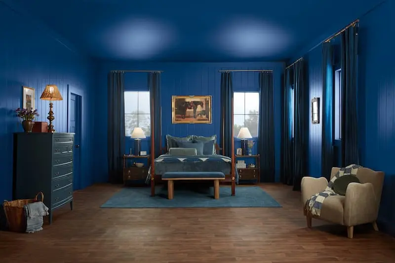
Valspar’s Encore, a cool blue, builds off the overarching theme from the success of several of the Paint Colors of the Year from last year: shades of blue deliver calm and a timeless appeal.
“A grounding and timeless atmospheric blue hue, Valspar’s 2025 Color of the Year, Encore emboldens consumers to elevate their interior and exterior spaces with their mood and happiness in mind,” says Sue Kim, director of color marketing at Valspar.
Also, with the abundance of blue last year, homeowners began to recognize the value of blue as a potential neutral in a space.
Encore leverages both the functionality and emotional value of blue.
“People are craving a happier home and Encore is an atmospheric hue that feels both modern yet familiar,” says Kim.
“It’s the perfect backdrop to build up joy in any space, inside or outside of the home,” she adds.
PPG by Glidden- Purple Basil

PPG by Glidden’s Paint Color of the Year for 2024 choice was Limitless, a fresh, warm yellow, cast in a solid supporting role as a neutral or as a subtle dominant color.
This year, however, their choice of Purple Basil, does a color about-face, with a high impact, jewel-toned purple, which is no shrinking violet (pun intended).
Paint colors follow a larger strategy, which is part of what drove this contrast against last year’s choices explains Alyson Ferrari, PPG color expert, Glidden brand.
“We see color trends as an evolution. In fact, Purple Basil was part of our 2024 trend forecast, supporting Limitless for its power as both a primary color and a neutral. Looking into 2025 and beyond, we’re encouraging consumers to step out of their comfort zones and go bold, truly transforming their spaces with color,” she says.
Purple Basil is meant to be that catalyst for homeowners to take that bold first step towards self-expression with color and to be confident in their personal choices for how their homes are decorated.
“Purple Basil speaks to consumers selecting colors that bring them joy, worrying less and less about resale value and what the neighbors will think, “says Ferrari
“This strong desire to connect to their environment and choose colors that make them happy, has consumers gravitating more toward bolder hues that add character and personality to their spaces,’ she says.
C2- Raku
Deep, dark and mysterious, C2’s Raku is a red with definite, heavy, brown undertones. It’s inspired by an ancient Japanese tea ceremony, and the color derives its authenticity from a centuries-old pottery technique that celebrates the unique, natural variations that come with handcrafted creations.
This acknowledgement of the beauty in the unique, is part of an overarching theme this year, C2 is encouraging homeowners to pursue their individual personalities.
This color is sophisticated and seems well-suited to rooms for formal activities, such as a dining room or a home office, with rich woods.
Dunn-Edwards- Carmelized

Dunn-Edwards describes their choice for Paint Color of the Year, terracotta, with warm brown undertones, Carmelized as “spicy” and “timeless”.
In contrast to several of the other colors this year that are geared to pounce with a statement straight away, Carmelized is a more patient neutral, mimicking the warmth of sun-baked clay.
This color is meant to act as a home base of sorts for homeowners to support other elements in the home that are meanignful and nostalgic, such as bolder colors, or vintage or sentimental decor.
In a press release, Lauren Hoferkamp, lead color expert at Dunn-Edwards said, “In the current fast-paced, high-tech age, we find ourselves drawn to more saturated and timeless colors to create personal spaces that feel welcoming, stylish, and grounded,”
Graham & Brown–Elderton
Graham & Brown’s Elderton taps into a desire to make home a cozy place to linger. A dark brown with quiet intensity, it is positioned as a “chameleon” that is versatile to adapt across a broad section of styles, to be as sophisticated or cozy as a homeowner wants.
This is a nature-inspired shade, named for an elder tree, and re-kindles a lot of what drove last year’s predominantly biophilc color palettes, calm creating when connecting with nature.
Elderton though, kicks it up a notch, and is a dramatic “theatrical backdrop,” according to Graham & Brown.
Dutch Boy- Mapped Blue
One of a handful of blue shades this year (in contrast with last year’s mostly blue-tinged choices), Dutch Boy invites homeowners to “chart your course to calm” with Mapped Blue, a soft blue with yellow undertones and hints of gray.
This medium blue has enough weight to carry a dominant color choice but is also soft enough to be used strategically as an accent.
Inspired by the sea and the tradition of charting wide-open waters while exploring, the color is intended to encourage homeowners to re-invent their spaces in ways that are fresh and invigorating.


