Today’s color trends reflect an enthusiasm for self-expression and bold colors. What’s interesting about this trend cycle is the incorporation of design techniques that consciously leverage how color and texture makes us feel, in addition to how they look.
Two of the top interior design trends that strategize around this color psychology are color drenching and dopamine décor. Both these trends make a viewer aware of spaces on an experiential level by tapping into different, positive psychological reactions. After years of color restraint, dopamine decor and color drenching also embrace maximalism, in different ways, but with similar, positive experiences.
How do these trends work and why are they dominating color application right now?
What is dopamine decor?
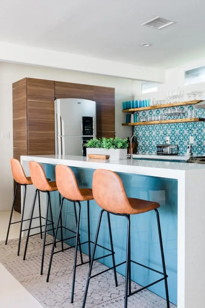
At its core, dopamine decor is about combining design and decor items that deliver the viewer joy, based in part on nostalgia. It’s a design scheme that is cheery and usually welcomes bright, bold colors and patterns, often with a touch of whimsy.
It’s called dopamine decor because of the way that it immerses a viewer in positivity, and delivers a feel-good vibe, dialing into dopamine’s impact on mood and energy levels.
“Dopamine décor, by design, is meant to make a space feel cheerful and comforting, and to create a sanctuary of positivity,” says designer Kathy Kuo of Kathy Kuo Home.
Dopamine is a hormone and neurotransmitter that is associated with rewards. It acts as a messenger, signaling the experience of euphoria (i.e. the rewarding experience). It also releases a hormone into the bloodstream, making you feel good. Not only does the release of dopamine deliver joy, but it also boosts motivation, and makes you more alert and focused.
Dopamine decor contrives this response by assembling decor and design items that signal the release of dopamine, and all the feel-good vibes that go along with it.
“By filling your space with colors and visual touch points that evoke happy memories and have fond associations, you’re setting yourself up to feel emotionally safe and relaxed in the space. When home design reflects your personality and the things you hold the most dear to your heart, it’s going to serve you in a really beautiful way that goes beyond daily function,” says Kuo.
Dopamine décor tips
While some other design and decor strategies are more formulaic, dopamine decor is wide-open, as its success prioritizes how your home makes you feel on a fundamental level, as opposed to how you think your home should look, or what trends you should follow.
Part of the positive impact of this design style is feeling like you have permission to ignore trends to create something personally meaningful.
Given how personalized this style needs to be to deliver the visual impact, the components vary widely based on individual taste, although there are common themes: bold, bright and fun.
Although the aesthetic is eclectic, its composition is not random.
- The danger with indulging in nostalgia, as a decor theme, is that it can easily be visually overwhelming, given that bold colors and textures are often prevalent. Think cheery as opposed to chaotic.
- The general advice is to pick a starting point, and to work outwards from there, making sure to incorporate neutrals so that the eye has somewhere to rest along the visual journey.
- Go for bold wallpaper and embrace bright colors (cheery yellow and pinks are commonly seen with dopamine decor).
- If you’re concerned about overdoing it with bold colors, refer to a color wheel to find complementary colors.
- Incorporate vintage pieces, particularly those that conjure sentimental feeling. Retro kitchen appliances and furniture are popular.
- Be tactile. Select fabrics and textiles that physically provide you comfort, in addition to sparking joy visually by tapping into nostalgia.
What is color drenching?
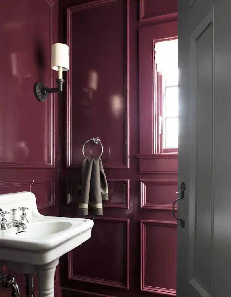
Where dopamine décor goes all in with overt, stimulating design, color drenching a space delivers a steely, steady calm that hits a viewer on a subtle, but very powerful emotional level.
Color drenching involves decorating a room either in a single color, or in slight variations on the same color. It boosts the traditional monochromatic color scheme with an elegant strategy that lets the viewer consume the space wholly, in a pleasing, uncluttered fashion.
“An explosion of color for an immersive experience, color drenching knows no bounds. It transforms spaces into visually stunning environments and amplifies the mood. Whether you opt for fresh, light hues or deep, moody tones, choose a color that speaks to you. Whatever color you select, it will undoubtedly make a striking impact.,” says Hannah Yeo, senior manager, Color Marketing at Benjamin Moore.
With color drenching, everything in a room is the same color (or tonal variations of the same color). It’s not just the walls. Literally everything within the sightline is “drenched” in the chosen color.
“Extend the wall color to other surfaces like furniture and radiators. This can also help conceal architectural details you may not want to highlight,” says Yeo
Different variations of a hue, along with different textures are layered for visual variety, explains Yeo.
“Once you have a cohesive background, incorporate various textures to add depth and interest.”
“Create dimension within a room by using different sheens to highlight the walls, trim and ceiling,” she says.
What is the psychology behind color drenching?
The psychology of color drenching works with the calm created when viewing interrupted lines. The eye can rest easy and the brain can relax without being jarred and alerted by transitions. The result is hopeful, happy and tranquil- the ideal environment for pensive reflection, creativity and respite, all of which are restorative.
Think of staring out at the sea horizon, without visual interruption and the calm that comes with it.
In addition to being peaceful, these flowing lines, with undertones, can make a room feel cozy. It is ideal for rooms that require tranquility or creativity, and is a popular technique for bedrooms, nurseries and home offices.
While it was common to see a single-color palette in recent years, as clean, crisp lines were the dominant style, particularly with all-white kitchens, color drenching welcomes colors across the spectrum, leaning into maximalism, while using a similarly pleasing concept of color continuity.
Color drenching application tips
You can use whatever color you’d like but be mindful of the fact that darker colors might make a room feel smaller, and vice versa for lighter colors.
“Consider the amount of light you get in the room. Darker rooms make a grand statement and deliver a full dramatic effect, while lighter colors can open the space,” says Yeo.
Given the penchant for drama with this color technique, homeowners may want to ease in, rather than committing to the whole house, or high-traffic areas.
“Start small. Powder rooms are ideal for experimenting with color drenching in unexpected hues, creating a jewel-box effect in an enclosed space,” says Yeo.


