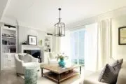
Blue is the “it” color for 2024, according to several of the major paint companies.
Colors of the Year from Benjamin Moore (Blue Nova), Sherwin Williams (Upward), C2 (Thermal), Valspar (Renew Blue), Dunn Edwards (Skipping Stones), Minwax (Bay Blue) and Krylon (Bluebird) represent the far-reaching range of blue, drawing inspiration from coastal vibes to outer space.
While these shades vary, the color expression and the paint color names capture underlying themes, namely optimism, creativity and moving beyond boundaries, all of which are innately energizing.
What does this gravitation towards blue say about color trends in general, and how does it support what homeowners currently prioritize in their homes?
What’s driving the blue trend?
Blue is a natural progression of the popular biophilic trend that has dominated décor for the last few years, where calming elements of nature are incorporated indoors.
For their choice for 2024 Color of the Year, “We knew we wanted to pick a blue,” says Sue Wadden, director of color marketing at Sherwin Williams.
“Nature-inspired colors took over at beginning of this decade, with greens and earthy tones in the first half of the decade, and now blues and ethereal tones are having their moment in the second half,” she says.
Paint companies are also tapping into blue’s broad-based appeal, versatility and depth, giving homeowners a unique canvas for self-expression.
“Blue is a favorite hue for the home for its flexibility and versatility. From soft blue hues as neutral backdrops to brilliant blues taking the center stage to everything in-between, there’s a perfect blue for every home,” says Hannah Yeo, senior manager, Color Marketing at Benjamin Moore.
For example, whereas Sherwin Williams’ Upward is playful and well-suited for coastal chic, (which is the “emerging trend in the coming year,” according to Wadden), Benjamin Moore’s contemplative Blue Nova is more dramatic and “offers an opportunity to be creative whether it is used to drench a room in color, or to define a portion of a room with a captivating hue,” says Yeo.
In addition to the colors themselves, paint companies have selected color names that encourage consumers to take a breather, whether replicating vacation vibes or promoting mindfulness, such as with Upward.
“Upward means to go in a direction from lower to higher, and this color feels like ascending into a place of peace and tranquility when applied to a space,” says Wadden.
Blue emphasizes wellness
Post-pandemic, homeowners have focused on health at home, and blue is a natural color expression of that priority.
Blue is “a great shade to use all around the home because people have positive connections to the color and it brings forward the best energy in a space,” says Wadden.
“With blue there is an unspoken emphasis on health,” says color expert and consultant Amy Wax, supporting the trend towards at-home wellness. And homeowners have become educated around how their décor choices can play a role.
“We have realized that we can create spaces that affect our wellbeing and our state of mind,” she says, and blue “is calming and puts us in a state of tranquility. It just feels good to be in that space.”
Blue triggers an emotional response, depending on the shade
Perhaps more than any other color, blue is strongly associated with emotions: Blue skies ahead suggests optimism; feeling blue suggests sadness or depression; true blue suggests love and loyalty.
In color psychology, blue is known as “the color of the mind”.
“Blue is one of the four psychological primary colors, which means that it creates a very strong, measurable reaction,” which varies depending on the shade, says color psychology expert Michelle Lewis of the Color Cure.
Scientists study and measure the physiological and emotional responses that occur when people are exposed to blue. Blue is known to lower blood pressure and slow breathing, so it is associated with calm. It also helps with mental clarity and intellectual stimulation.
That means that homeowners wishing to incorporate blue in their décor palette and reap its psychological benefits should start by thinking about the environment they hope to create and then choose the appropriate shade.
“As a homeowner, what reactions am I trying to build in this space? What feelings do I want people to feel?” says Lewis.
For example, it might be better to have a shade of blue that is energizing and inspiring in a home office, whereas a soft and subtle shade is more serene in a primary bedroom. The feeling starts with choosing blue and is reinforced by nuanced undertones.
Lewis encourages homeowners to look to undertones to make their paint choices perfectly fit the room and their preference.
“This is important to think about because you can either do a true hue, really strong, bright, vibrant color like a cobalt blue,” she says.
“If you add white to the color, it’s going feel much more youthful, versus if you add the gray undertone, it is going to be more calming and serene. If you add a black undertone, then it’s going to be much more grounded and serious,” says Lewis.
Tips for using blue
It’s relatively easy to integrate blue into the color scheme, either as the primary or accent color, because as Wax points out, blue goes with everything.
“Go around the color wheel in your mind. Blue goes with yellows, oranges, reds, purples, blues, darker blues, lighter blues, greens, and you are back at yellow again. It even goes with taupe, greys and browns,” says Wax.
“A simple blue, white and cream color scheme creates a breezy beach getaway feel or a complementary shade of tangerine or orange can bring out the best of both blue and orange for a fun, creative space,” says Yeo.
It’s also important to consider the orientation of the room in question, and its access to natural light, which will make a blue feel warmer or cooler. A room with northern or eastern exposure will have less natural warmth from the light, so it would be better to opt for warmer blue tones in such a room, if that is the desired hue.
Blue is timeless and reliable when integrating into a color palette, assuring cautious homeowners of longevity with their color choices.
The versatility of blue gives homeowners the “ability to add a little bit of drama or to be calm. Both ends of scale are classic. I feel like blue is a color that really is going to stand the test of time,” says Wax.


