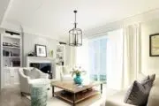
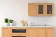
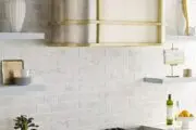
Bold and bright colors are taking over the home, with red particularly prominent, especially with accents, thanks in part to the viral unexpected red theory sweeping social media feeds.
The unexpected red theory is very much like it sounds. Place something red in a room, and the result is unexpected.
The idea is to jar the visual experience just enough to capture the viewer’s full attention, so that they can benefit from the aesthetic and psychological benefits associated with red.
This is made more obvious when red is used in combinations that one wouldn’t necessarily expect. The theory is that, rather than altering a space on a more fundamental level, perhaps by painting the walls fully in a rich red, the introduction of a dash of red here and there takes another palette and elevates the overall experience of a room.
The ‘unexpected red’ can be as basic as a small accent or artwork, or something more substantial, such as kitchen appliances or furniture.
What’s interesting about this color strategy is that it’s both simple but heavily strategic, and how it integrates color psychology while contravening the anticipated visual response by working outside standard interior design practices.
The theory behind the unexpected red theory
The use of red to contrive design isn’t a new idea, but interest is peaking as designers are actively using the concept and sharing their ideas.
Among them, designer Taylor Migliazzo Simon has generated a lot of buzz around red with her viral TikTok video, in which she extols the virtues of juxtaposing red against an unlikely partner- purple, and the whimsical beauty of red fixtures and accents.
“The unexpected red theory is adding anything red, big or small to a room where it doesn’t match, and it (the room) automatically looks better,” says Migliazzo Simon. “This can apply to a lampshade, sofa, or even a small pillow,” she says
Part of the success of the overall impact of red, according to Migliazzo Simon, is its intentionality.
“The idea is that adding something in a bold red to your space is so clearly a decision, that it makes your space look more intentional, thoughtful, and ‘designed’,” she says.
Bursts of red for statement-making style have long been a fixture in fashion and design, and the unexpected red theory leverages the proven success of that impact. For example, red lipstick or nails are timeless, elegant showstoppers that simultaneously grab attention, but recede into the rest of the aesthetic, elevating the overall look.
The psychology of red
Red is powerful as a decor tool because of the significant and varied psychological reactions to the color. It’s a color that hits on an instinctual level and alerts the viewer, both with physiological and psychological response.
“We are most heavily impacted in our bodies by the color red. Our heart rate increases, blood pressure goes up, our pupils dilate, and we are prone to sweating. It’s the only color that creates this reaction in our physical body,” says color psychology expert Michelle Lewis of the Color Cure.
“It’s the first color we see in the visible light spectrum, so it prompts a quick notice and reaction,” says Lewis.
It’s not surprising that distinct placement of red items against a backdrop of other colors, as is done in executing the unexpected red theory, is impactful.
Research has shown the people naturally gravitate towards red objects as more desirable. The University of Rochester conducted a study in 2008 that found that “people overwhelmingly view (others) wearing red, red lipstick or red hair more attractive,” says Lewis.
Adding layers to the response, red is a color with inherent opposition. It’s associated with love, evil, passion, power, aggression, danger, and opportunity. Some people find red energizing and beguiling, while others find it stressful on a subliminal level, largely based on personal experience around the color.
“It’s interesting that we simultaneously find red things desirable, but potentially threatening, “says Lewis
Red is used in traffic, where it makes you alert and pause to assess for hazards, with stop signs and red lights. It also represents romance and is known to stimulate hunger, so is widely used in restaurant marketing. It’s all about context, which the unexpected red theory does pretty masterfully.
“I think the (unexpected red) theory gained so much traction because red brings out a different emotion in every single person,” says Migliazzo Simon.
Can red be a neutral?
If red goes with everything, as the unexpected red theory suggests, does that mean that it is neutral? Yes and no, according to the experts.
On one hand, red has shown itself as a stylish support system against a spectrum of other colors.
“In my opinion, red goes well with everything,” says Migliazzo Simon. “Of course, you want to make sure it’s the right tone with the rest of your furniture, but overall, you can’t go wrong with a pop of red,” she says.
But given the emotional weight that red carries, too liberal an application may be overwhelming, so strategy is important.
In color theory, according to Lewis, “A neutral color not only is defined by the absence of saturation or intensity, but they also do not create a strong reaction when viewed. Whether it’s black, white, gray or beige, we do not react to them as we do to primary colors. Red is undeniably one of the strongest reaction-causing colors, so it cannot be used as a neutral,” says Lewis. “It can, however, be used as a brilliant accent,” she says.
Implementing the unexpected red theory into design
The general advice is to start small, and to pick a focal point, being mindful of other color influences in a space.
Think bedding in a primary suite, fixtures in a bathroom or appliances or accent cabinetry in a kitchen.
Lewis cautions homeowners to remember that “red gives a strong pop, a jolt of physical energy.”
“My only warning would be that too much red can elevate emotions – especially negative ones. Keep key red pieces balanced with other calming colors so feelings of anger, discontent and frustration don’t rise too quickly,” she says.
Take advantage of some of the popular, grounding shades that exude calm, such as blues, greens, purples and taupes to carry the weight of the aesthetic, with well-placed, proportionately smaller amounts of red placed to pop.
Red can be risky, but it comes back to that duplicitous relationship that red has with psychology; with the risk, comes reward.
“It takes a level of confidence to incorporate red into your space, and it always pays off,” says Migliazzo Simon.


